rebuilding vietnom's site around its menu and story
A five-week redesign of a restaurant's site and menu, pairing a restructured information architecture with clearer navigation labeling.
apr 2024 - may 2024 ⋆˙⟡
role
UX Designer
team
PMC @ UCSD
skills
Usability Testing
Content Audit
Wireframing

overview
All about the project!
Vietnom is a Vietnamese restaurant in San Diego with a site that was mostly empty: a landing page, a menu, and leftover placeholder text from the template.
I came in through the Product Management Club with five weeks and a team of five: two designers, two developers, and a PM. The club had just been founded and we were its first cohort, all first and second years, so most of us had never shipped a product with a team before.
I worked across research, information architecture, and the menu structure, and paired with the other designer through wireframes and final designs.
the problem
An empty storefront
The nav bar was effectively empty. Two destinations, home and menu, and home itself was blank.

A customer landing here could see the name and the menu. Nothing else. Which left us with one question.
How do we build a site that shows customers who Vietnom is, what they serve, and where to go next?
research
What we heard
We started with the owners, who told us customers kept calling to ask things the site should have answered: hours, location, whether they took reservations, how to order online. None of it was on the site.
Vietnom sits next to campus, so each of the five of us interviewed two students, 10 total. They expected contact info and hours within seconds of landing, and the menu without hunting for it. When a site didn't give them that, they left.
Both groups pointed at the same gap. The site looked unfinished, and more to the point, it answered almost nothing a customer would want to know.
We put everything on a FigJam board, one note per observation, and grouped what went together.

Three clusters: people couldn't find the basics, the site and its content were empty, and there was no way to take action.
We traced the paths a customer would take to do each, and that's where ordering intent broke down. The menu was the only place to go, online ordering sat at the bottom of it, and nothing else had anywhere to live.
wireframes
Postcards from Vietnam
The owners had a story to tell. They wanted the site to convey the authenticity of their home in Vietnam, not just list what they served.
So we pitched a "postcards from Vietnam" theme, working small details through the site that tied back to it.
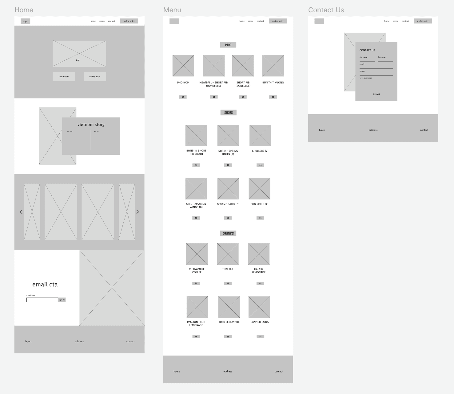
We tested mid-fidelity wireframes with the same students we'd interviewed, and walked the owners through them separately.
7/10
preferred the new menu flow, but wanted dish descriptions.
8/10
liked how many spots were marked for photos.
We added descriptions to the menu structure and carried the rest into the final designs.
final design
Vietnom's new site
We started with the navigation bar, as it needed to exist before anything else had a place to live.
The landing page now carries what customers were calling to ask. Their logo, an our story section, real photography, basic restaurant information, and an email signup.

The reservations feature opens a popup with instructions and a number to call. The owners prefer taking them by phone over a third-party system like Resy, so the design makes the phone the path rather than working around it.
Online ordering sends customers straight to DoorDash, which the restaurant already uses.
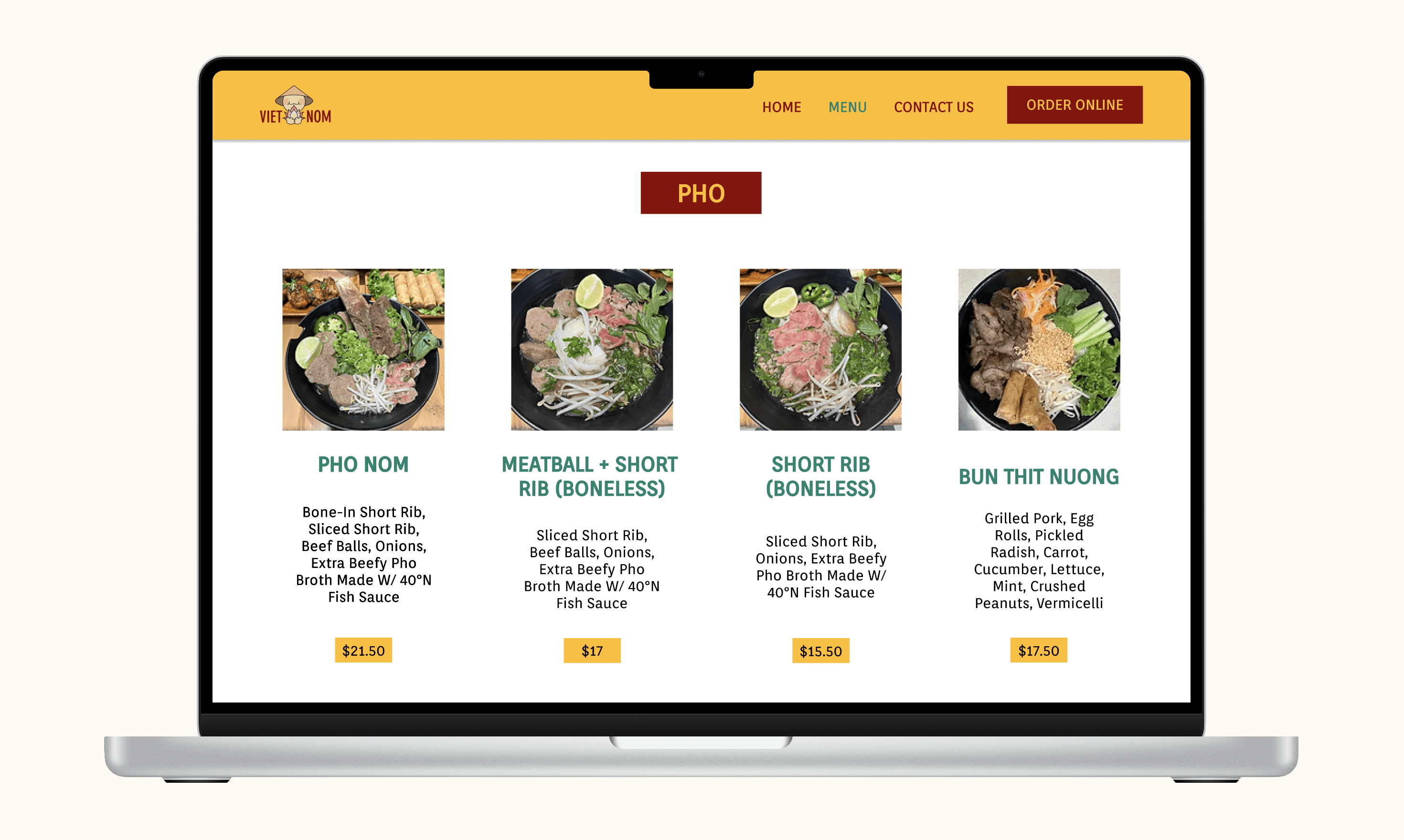
The menu is reorganized and categorized, with a photo, description, and price for every item. The descriptions were added after testing showed students wanted them before ordering.

The contact page covers catering, large parties, private events, and anything a customer would rather write than call about.
Colors and type we decided with the owners, keeping as much of their original palette as we could. The site needed to feel like a continuation of what they had, not a replacement.
reflection
Lessons learned
and key takeaways
The owners were happy with it, and our PM checked in a month after launch. They told us reservations were up 20%.
With more time, the thing I'd want most is testing the final site. We tested mid-fidelity wireframes and revised from there, but nobody used the real thing before it went live. The feedback loop ended one step too early.
The timeline shaped what we could design. We were handing off to our developers on the same five-week clock, so anything complicated was off the table before we drew it.
A year later, I checked and they'd moved to a different site. I don't know why, but it taught me that a design the owners can't keep running isn't finished. We never asked what they'd be comfortable managing after we left, so the site worked beautifully right up until it needed changing.
