personalizing the way san diego riders board
A focused redesign of Pronto's boarding flow — pairing a one-time personalization survey with a reworked Tap-to-Board and QR toggle.
apr 2025 - jun 2025 ⋆˙⟡
role
Product Designer
team
DSGN 100 Group
skills
User Research
Tradeoff Analysis
Rapid Prototyping

overview
All about the project!
PRONTO is San Diego's official transit app, but most UC San Diego students use it for one thing: boarding the bus or trolley.
Throughout college, we heard countless friends vent about how frustrating PRONTO was to use, and honestly, we shared many of those same frustrations ourselves.
After 18 user interviews, we discovered the biggest pain point wasn't the app as a whole, it was the boarding experience.
Rather than redesign every screen, we focused on creating a personalized onboarding flow that asks new users how they prefer to board, then carries that preference through the entire app.
the problem
Boarding fell short
56%
reported the QR code was slow to load, hard to scan, or both.
61%
felt that there was a lack of personalization in the app.
18 interviews revealed one consistent pain point: boarding. Regardless of riding frequency, participants struggled most with accessing and scanning their pass.

To really put ourselves in our users' shoes, we reenacted a scenario we saw play out again and again with Pronto. Watch this short clip my teammates and I created to capture the struggles a typical rider faces.
While our clip is a little dramatized for laughs, the struggle is very real!
A boarding pass that's supposed to take one second was, for over half our riders, the slowest part of the trip. It became clear that QR scanning alone wasn't a reliable way to board, which lead us to question:
How can we streamline the boarding flow so it adapts to each rider instead of the other way around?
concept
exploration
Shaping the solution
Concept 2 User Flow
Rather than fixing the QR code, we wanted to focus on getting riders to the method that worked best for them.
QR issues were often hardware-dependent and outside the scope of a UI redesign, so we initially designed an experience that displayed two options for boarding, the QR code and Tap-to-Pay

Concept 1 placed both Tap and QR directly on the boarding screen, so riders always had both methods available without having to choose one in advance. We also added an Auto Full Brightness toggle, so screens would brighten automatically to help scanners read the QR code more reliably, and moved payment method visibility and switching to the bottom of the screen, so riders could check or change it without leaving the boarding flow.
From there, we took this concept back to our original interviewees to hear what they thought.
77%
liked the addition of the
Tap-to-Pay feature.
6.5 / 10
average satisfaction
rating across all users.
During critique, our TA pointed out that asking riders to choose every time simply replaced one friction with another. That feedback, combined with our interview insights shifted our direction.
Instead of surfacing both options every trip, we drafted an onboarding user flow where riders choose their preferred boarding method once, and the app remembers.

final solution
Introducing personalized onboarding
Following this flow, new riders are greeted, then guided through three quick setup steps before landing on a boarding screen that's already personalized to them.
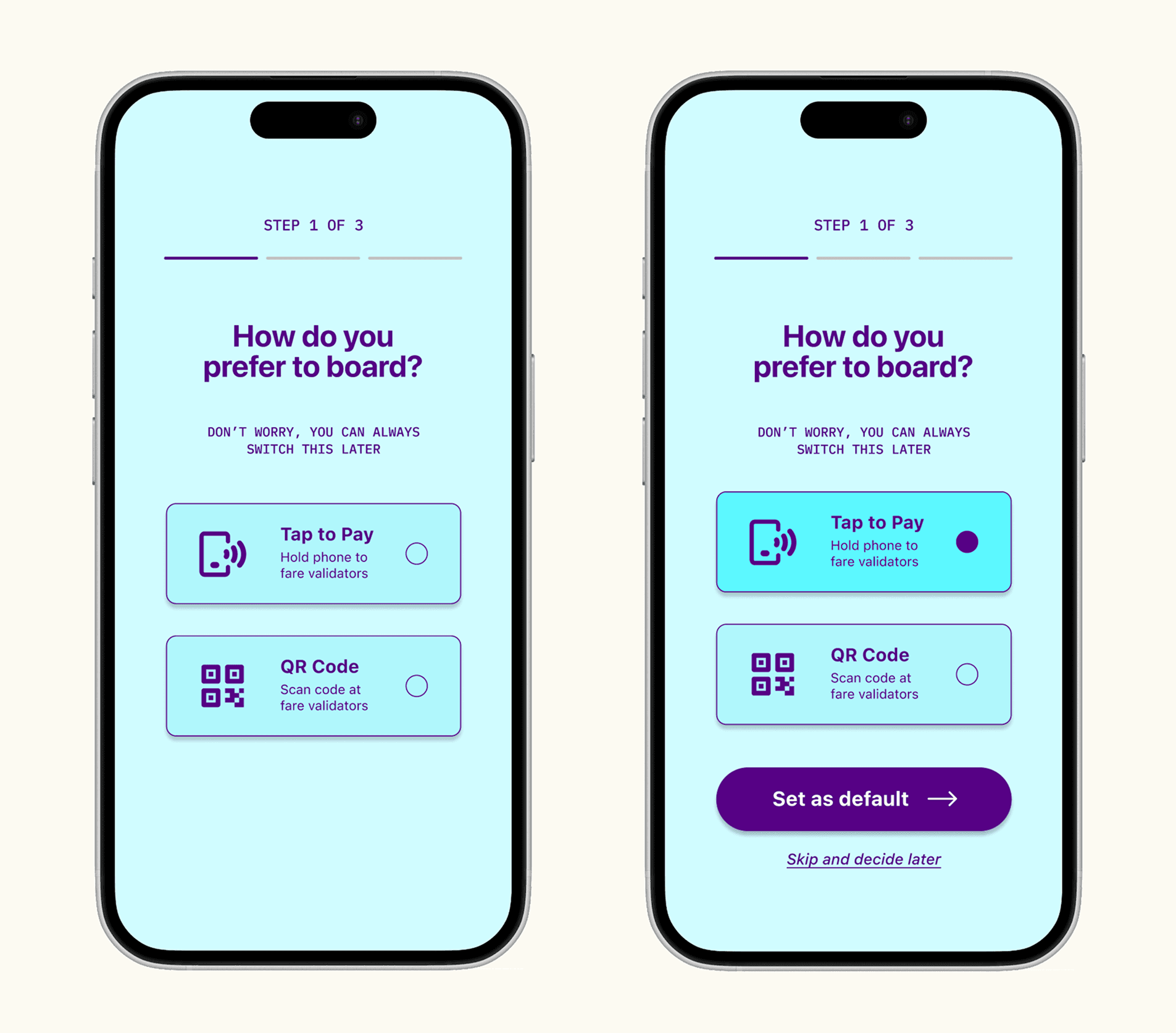
The first decision asks riders how they prefer to board. Rather than forcing users to choose between Tap and QR every trip, onboarding lets them set a default once while still allowing them to switch anytime later.

The remaining questions personalize everyday transit. Riders can save a home stop for quicker trip planning and choose whether to receive timely arrival reminders that help them catch their bus or trolley on time.

The personalized boarding screen removes a daily decision by opening to each rider's preferred boarding method. When they need to switch, the alternate option is always one tap away.
In addition, a one-time confirmation reinforces that their preference has been saved. On future visits, riders will see a simplified boarding screen while retaining quick access to the alternate method.
reflection
Lessons learned
and key takeaways
If we had more time…
As this was a class project, we stopped after presenting our final solution, but we're proud of where it landed and would want to keep pushing it further, starting with usability-testing the onboarding flow itself rather than just interviewing people about the concept.
We'd also want a sample beyond UCSD students with free passes, to see whether "Tap first" is really the right default for a wider range of riders, including those on older phones where NFC support isn't guaranteed.
What I learned…
I learned just how much good design shapes someone's everyday life. Pronto's slow QR code wasn't a minor annoyance, it was a daily inconvenience for students just trying to catch the trolley.
The fix didn't require reinventing the app. Sometimes one well-placed feature is enough to make someone's routine noticeably smoother.
