Role
Timeline
Team
UX Designer
2026 - Present
COGS 127
Riding Without Fear: Safety
for Solo Female Riders
Redesigning the Uber experience to enhance safety and trust for solo female riders,
driving meaningful change in how women navigate rideshare from request to arrival.

Every time a solo female uses a rideshare service, she has to deal with a lot of stress that people do not talk about. Even though Uber and Lyft have things like Women's Preferences and Women+ Connect, they still do not have female drivers. In the United States, about 20 to 23 percent of its drivers are women. Because of this, solo female riders have to come up with their own ways to stay safe when they travel. They do this because the star ratings that Uber and Lyft use to measure how good their service is do not really measure how safe it is.
The emergency tools that you can find on the app take a while to use, so female riders have to come up with their own ways to protect themselves. They do things like text their friends, where they're making fake phone calls, and quickly check the license plate of the car when they get in at night.
Uber has had over 3,300 lawsuits since 2026 because many users said that their drivers hurt or harassed them. Even with all these lawsuits, the number of people getting hurt while using rideshare services keeps going up. The safety tools that the app has now are mostly used after something has already happened. We need to come up with safety solutions to fix the problems that we have now.
This project is trying to figure out how to make sure solo female passengers can get rides that are safe and don't need a male driver. We want to answer two questions. The first one is about how to connect drivers with the people who need rides and how to keep them safe when they are driving. The second question is about what female drivers need to be safe when they are picking people up and dropping them off. We want to make sure that female drivers and passengers are safe when they use rideshare services during the parts of the ride that can be the scariest, like when they are matching with a driver, getting picked up, and getting into the car.
Overview
User Research
We conducted three user interviews that asked 30 questions, allowing us to gain a deep understanding of our users' needs. The sample included two extreme user groups: people who rode alone at nighttime and those who rode Uber with companions. The study discovered that peak stress during the entire journey occurs at the moment when passengers get picked up.
All three participants identified the moments immediately before and during pickup as the most physically and emotionally exposed part of the experience. Daniella described how she had increased vulnerability after dark because the empty streets made her feel extremely unsafe.
All participants executed their pre-board routine, which included verifying the license plate, checking the car's make and model, matching the driver's face with their profile picture, and waiting to hear the driver state their name. This routine serves as the general starting point that is usually followed before any ride can commence. The driver's first greeting establishes the initial safety assessment that passengers will make, and the riders will use the first 30 seconds to assess the driver. Some expectations they may have include:
A professional driver who maintains appropriate silence while driving creates a safe atmosphere.
A driver who shows excessive friendliness with the passenger creates unsafe driving conditions, which made one passenger stop the conversation because they answered too many personal questions.
Though Uber has a set of safety features, users remain unaware of emergency features despite their existence. Participants understood that 911 buttons and location sharing existed, but none felt confident locating them quickly during a real crisis. The participant explained: "I know it's there, but I don't trust myself to find it." This is because the features aren’t highlighted well enough on the app itself, making it hard for users to find.
All in all, these findings pointed to a clear design imperative: solo female riders don't need more reactive safety tools, they need proactive transparency at the exact moments they feel most exposed. The three main design opportunities emerged from the pickup hand-off, the driver's first impression, and the limited availability of female drivers.
High-Fidelity Prototypes
After sketching out our lo-fidelity and ideas, we developed multiple rounds of high-fidelity prototypes to help us bring our concepts to life. High-fidelity prototypes allowed us to translate our lo-fidelity sketches into a polished, realistic representation of our final design. At this stage, our focus shifted from basic structure to visual detail, ensuring our new safety features felt seamlessly integrated within Uber's existing UI. Below are screens that we developed to highlight our new features. After following Uber's usual flow of booking a ride, users will have to make a number of decisions:
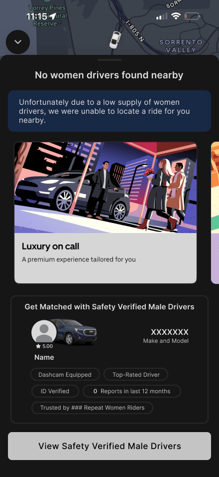
This screen appears when no female drivers are available in the user's area. Rather than leaving the user with a dead end, users are offered a path forward by presenting the Safety Verified Male Drivers option. By doing this, we give users a sense of agency and reassurance even when their first preference isn't available and that there are other options available.
Below the initial notification lies a sample verified driver profile card that is displayed, giving users a preview of what to expect. We thought that it would be important to include things like the driver's rating, vehicle details, and safety badges like "Dashcam Equipped," "ID Verified," and "Trusted by Repeat Women Riders." We understand how frustrating things can be when a user's first choice isn't available, so this added feature provides transparency and helps build trust and encourages users to feel confident moving forward with a male driver. Ultimately, this will direct them to tap "View Safety Verified Male Drivers" to continue and view their choices.
Lack of Women Drivers Nearby
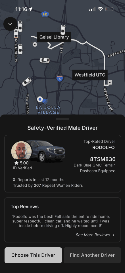
Once a user taps to view Safety Verified Male Drivers, they are brought to this screen, displaying a detailed profile of an available verified driver. The design prioritizes the information most relevant to a solo female rider's safety considerations, keeping the same safety information that was shown in the previous screen, allowing users to quickly assess whether they feel comfortable proceeding with this driver or not.
Underneath the driver's safety tags and vehicle information, we decided to include top ratings from another woman rider without requiring the user to go searching for it. Users can view more reviews if needed to give them an even higher sense of security.
After this, users can either choose to go with this safety-verified male driver, or ask the system to search for a different driver, giving them full control over who they ride with.
Nearby Safety-Verified Male Driver Available
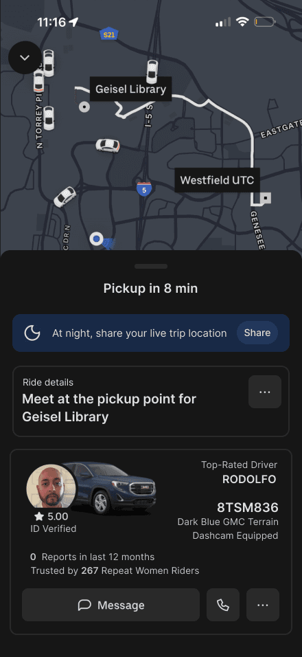
Once the user selects their driver, they are brought to the pickup screen which confirms that their driver, Rodolfo, is on his way and will arrive in 8 minutes. Again, the same safety tags and vehicle information from the previous screens are carried on over into this screen. This helps ensure that users feel informed and secure throughout the entire pre-ride period, not just during the driver selection process.
In addition, there's a blue banner at the top of the screen that reminds and prompts the user to share their live trip location. This feature is automatically surfaced at night when solo female riders are most vulnerable. Rather than burying this option in a settings menu, we decided to build the nudge directly into the ride confirmation flow, making it as intuitive and as easy as possible for users to loop in a trusted contact with a single tap.
Confirmation of Pickup
Throughout our high-fidelity prototypes, we tried to make every design decision with the solo female rider's sense of safety and confidence in mind and at the forefront. From the moment the user books a ride, to the moment they get out of the vehicle, we wanted to ensure that they felt as safe as possible. We made sure to include all of the safety-information in places that were visible, accessible, and easy to act on.
User Testing
We tested two variations of our redesigned flow with two UCSD female, nightly Uber users. Each user was part of earlier stages of research which provided a useful frame for feedback. The testing process involved showing each user both prototype versions and asking for feedback on layout, information hierarchy and content in each screen.
Both users agreed that the prototypes felt similar to Uber's UI and overall we received positive comments about the feel of our redesign. Our feature that received the most uniformly positive feedback were the oval safety tag bubbles, the large driver photo and vehicle photo and the women only star rating. Each user commented however that we could condense a few of the screens as our screens contained too much information for such a high stakes, fast, decision point. In particular, one user stated she would likely be tapping through screens quickly without reading any information, which showed that just because we put lots of detailed information on the screen, it doesn't mean users will consume that information.
The single, most valuable piece of information that each user mentioned independently was the women only star rating. What made this element unique compared to the other positive feedback was its direct, targeted nature relative to the user's identity as a female user.
What we learned from this process was that trust is a result of specificity, not volume. When designing features that will build a sense of trust users care more about the information that is most relevant to them, not the most detailed information. This insight became the driving force behind our final redesign: clearly surface only the relevant information.
Before-and-After Stories
The current screen that the rider sees with no female drivers available gives a lot of nothing-an indistinct message, a large advertisement and one button. For a solo female passenger trying to make an on the fly safety decision that simply is not good enough. Our goal was to fill that gap by redesigning both the fall-back screen and driver profile to be a more accurate representation of how our users think and act.
Through the user tests, it became obvious that the original screen was confusing - the advert was overwhelming the layout, the only action you could take was to accept a male driver, and you weren't being recognized as potentially feeling uncomfortable with that idea. We've concentrated on providing user clarity and options before we give you something to do.
Ads were collapsed into a smaller horizontal strip and clearly marked "Sponsored," freeing up screen space on a page where the user had to feel trusting first.
A "Notify me when available" option was included, enabling women uncomfortable with the idea of a male driver to easily stay in the app and wait rather than risk being stood up outside.
The "Safety Verified Male Drivers" were moved further down the screen, allowing users to fully take in all options before being prompted to take an action-if it's at the top, it seems like the only option they have.
The "Cancel Ride" option was included at the bottom so the user never feels cornered, enabling her to back out to an alternative at any point in the decision-making process (such as Uber XL or Uber Black).


The driver profile is ultimately where users make their final decision. Our updates concentrated on exposing what really inspires confidence sooner and more readably.
The driver/vehicle image was magnified so users could be sure of the match when they reached their pickup-an essential safety behavior the original was too small to accommodate
The star rating was accentuated with an orange highlight and "2 min away" added-these items captured the user's eye at the driver's score and grounded the waiting time
The safety tag bubbles were made more colorful to make them easier for the user to skim, enabling visual recall without having to re-read labels-through use this has proven effective.
The "Trusted by ### Women Riders" tag was expanded to its own devoted women's star rating section-testers agreed in separate conversations that this one feature was of paramount importance so we granted it its importance.
The Top Reviews section was somewhat shortened to give room to these updates. Testers agreed that this feature was good for more context but the women's rating was paramount to their decisions.
What I Learned
The greatest lesson learned for me during this project: trust comes from specificity and not quantity. I started with the assumption that more safety information for female solo riders would translate into more comfort-my testing found the opposite to be true. Riders were swiping through verbose screens unread; the single feature, the female only star rating, sold the rider precisely because it validated her identity, not because it bombarded her with options.
This completely shifted my design process from "what can we show the user," to "what does she need to feel safe in this moment?" The right cue at the right time-driver match, women's rating, clear way out-instilled more trust than more features could. If I were to iterate on this project again, I'd carry this lesson even further, reducing word count, enhancing hierarchy, and including only those elements that can earn a riders' trust during a high-stakes, snap-decision point.

谢谢! Thanks for visiting!